Neurodesign: MyChart
Project Overview
Neuroanatomy and pathways involved with attention and distraction
Critical Analysis of attention fragmentation experienced on MyChart
Summary of attention and distraction research from the past three years
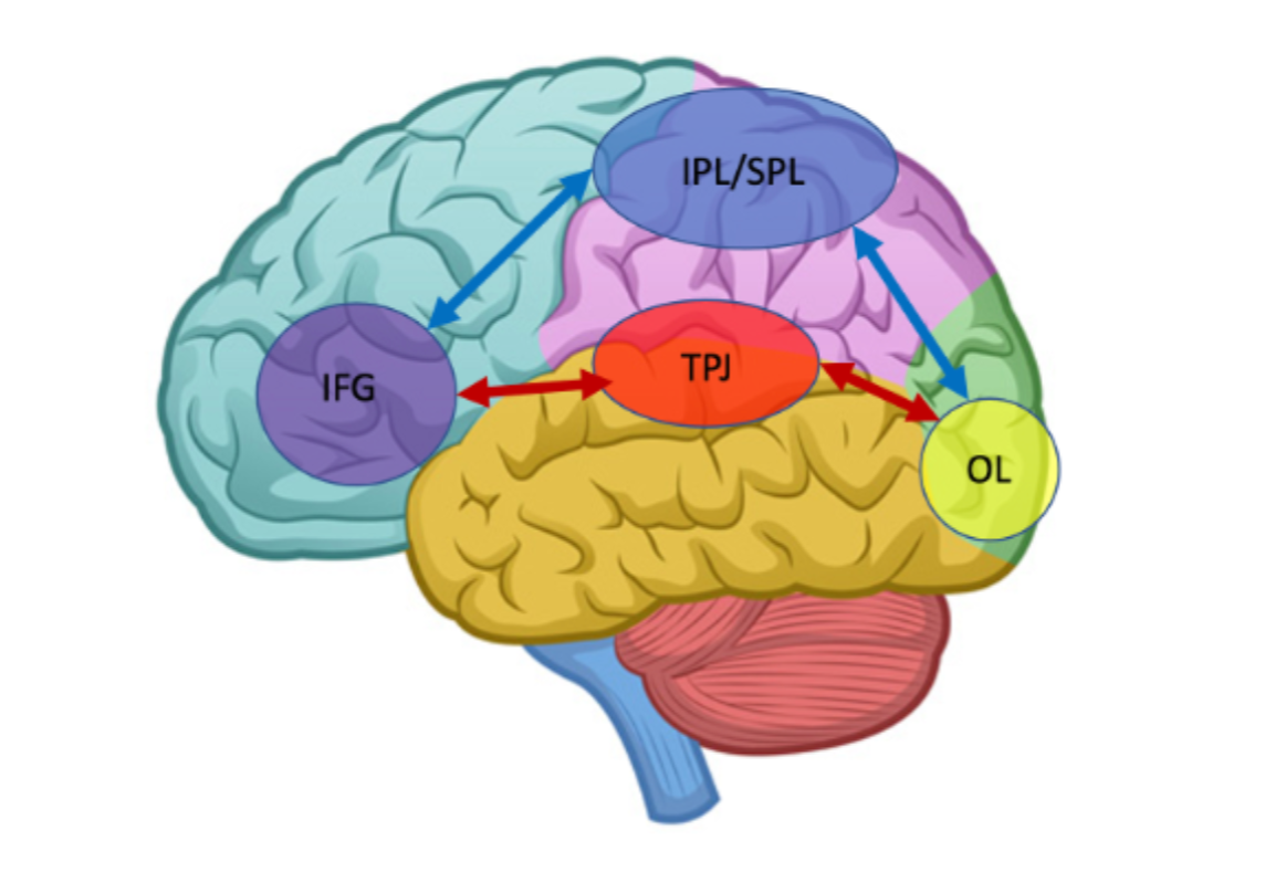
Attentional neural pathways. Original diagram source
Superior parietal lobule (SPL) and inferior parietal lobule (IPL) are regions within the dorsal part of the parietal cortex subserving top-down (effortful) attentional orienting. The top-down connections are shown in blue arrows.
Temporo-parietal junction (TPJ) is a region within the ventral parietal cortex subserving bottom-up (automatic) attentional orienting. The bottom-up connections are shown in red arrows.
Both, SPL and TPJ, are responsible for attentional modulations visually evoked activity in the occipital lobe (OL).
The inferior frontal gyrus (IFG) serves as convergence area for bottom-up and top-down attentional control, (Shomstein, 2012).
Task Analysis: MyChart
MyChart is a near ubiquitous software used to enable communication between medical providers and patients. There is an absence of sensory events on the MyChart webpages. Nothing flashes, blinks or moves; nothing serves as task cues. MyChart therefore forces users to rely primarily on their voluntary attention, which is more exhausting for users (Gazzaniga et al., 2013).
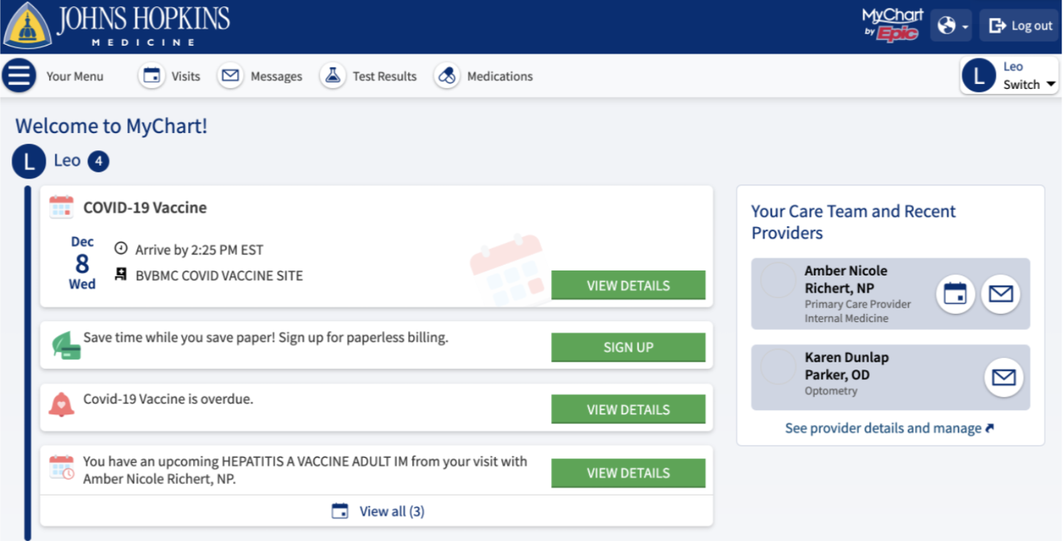
Once signed in, the patient home screen offers a single reflexive attention experience: the green buttons that stand out against a white background (Figure 1). Titles, such as “View Details” or “View Message” inside the button also draws attention but the rest of the home page has text as well, so the green is primary engager of our bottom-up processing pathways. This would be fine if the green buttons led to helpful pages, but unfortunately our attention gets further divided as we proceed.
Figure 1. MyChart home page view
The task I selected to study is trying to view a message in MyChart after receiving an email notification that a message has been posted. This was experienced on a desktop computer, but the issues and solutions discussed also apply to the mobile app. When a patient gets an email from MyChart about a new message, the subject line says, “New Information Available in Johns Hopkins Medicine MyChart” followed by [***messageID:76393419***]. In the body of the email, it says “You have a new message” which is hyperlinked. However, from the very beginning there is language inconsistency: “message” should replace “Information” in the subject line.
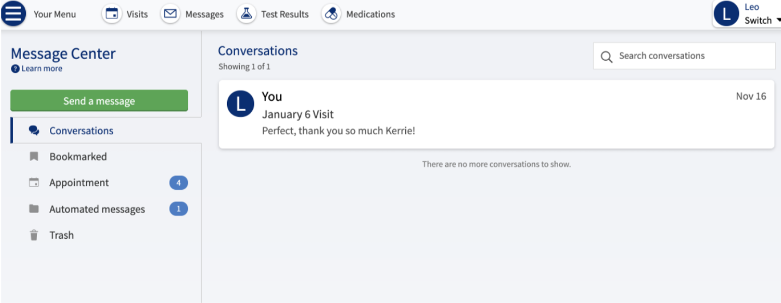
The hyperlink takes me to a sign-in page and where I have to login into MyChart, understandable for privacy reasons. I’m then taken to the Message Center, specifically the Conversations section, another example of inconsistent language (Figure 2). The only item in my conversations tab is an old message chain, so the hyperlink has failed to direct me to the new message, and effortful processing is engaged again.
Figure 2. When a user clicks View all messages from the Home Screen
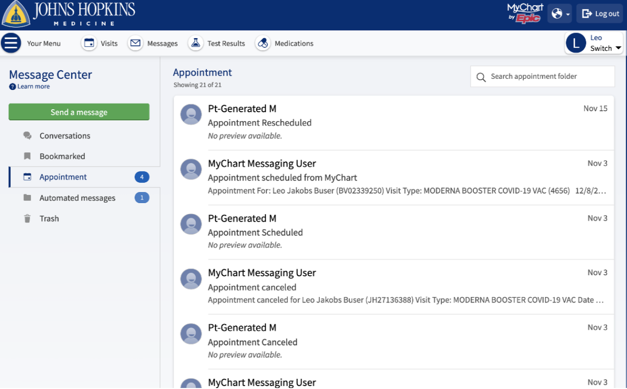
My attention is drawn to a menu at the left and the number “4” icon to the right of an Appointment label, and the “1” to the right of Automated messages. Clicking on the Appointment section, a list of messages related to appointments is presented (Figure 3). Looking at the message titles and previews signals content that I would associate with Automated messages.
Each item listed has three rows of text: a subject header, subtitle and preview of message. There is not a lot of space between each listing, and only a thin, light gray line separating messages, putting more cognitive burden on me, the user. I was tempted to click away from the page but decided to try scrolling down and did find the four appointment messages that hadn’t been opened. In total 21 appointment messages were generated for a total of four appointments, so clearly some of those should be categorized as automated messages.
Figure 3. Appointment section in the Message Center. There are 4 new appointments, but they don’t show up at the top of the list, you must scroll down to find them.
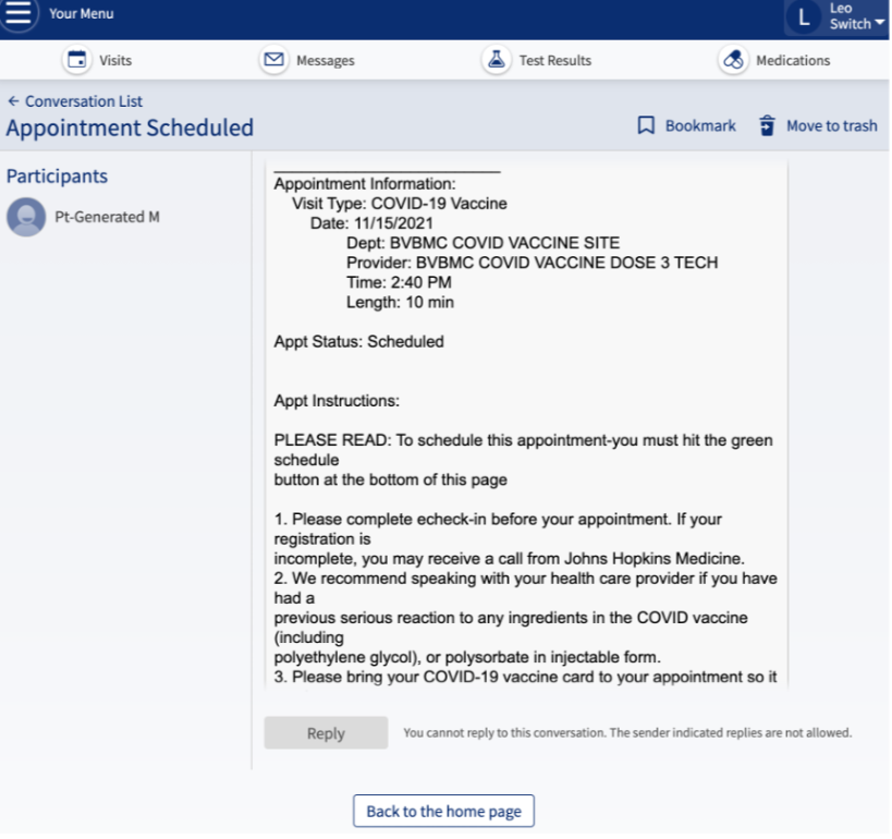
Clicking on one of the unread appointment messages brings me to a message that looks like automated information. I’m not allowed to reply to the message, additional proof that this message should have been in the Automated messages section (Figure 4). Why did I just take the time to read an automated message? The vague description of the email notification allows for the possibility that the message is of importance from my doctor, so of course we are going to check and see what the message says. While privacy must always be considered, the labeling of automated messages as such would be a time saver.
Figure 4. Example of appointment message. Not being able to reply to this message signifies an automated message, but this message is not categorized as automated.
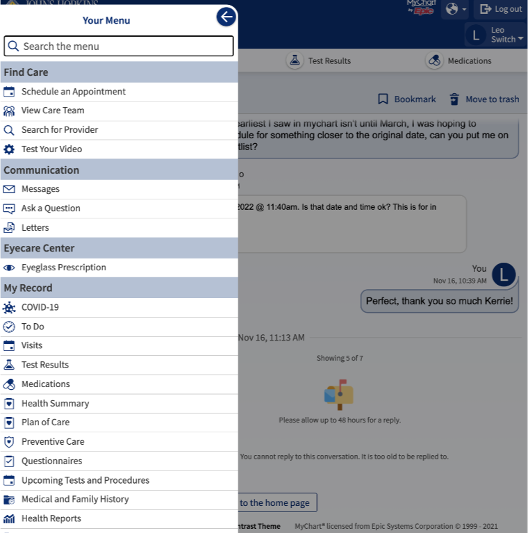
Although the message adventure was a waste of time, I decided to navigate to the home page. When I began this project, no “Back to the home page” button at the bottom of the page existed. Now there is one. Hopefully the addition of this button is a sign that MyChart is working on its usability issues. Prior to the button, my first thought when wanting to return to the home page, was to choose “Your Menu” in the top left corner. However, when you click on it, a side panel on the left pops into view while the rest of the page is grayed out (Figure 5). Immediately users are overwhelmed by a fully expanded local navigation that has 53 rows of text. You must scroll to see the full list (Figure 6).
Figure 5. When a user clicks “Your Menu” this local navigation panel appears on the left.
Figure 6. “Your Menu” continued
The last item to choose is a “Back to Home Page” label. The lack of consideration by the designers is astounding. I would be very interested to see eye tracking results of people navigating this lengthy side panel. A key use case for accordion menus is when a page contains a large amount of related, yet modular information, only a portion of which may be relevant to a given user segment. “By hiding most of the content, users can spend their time more efficiently focused on the few topics that matter” (Loranger, 2014). Eye tracking evidence documents search behavior as related to click-down menus. “While it is very likely that users will see one of the initial items, it cannot be assumed that users will have seen intermediate items, particularly for longer menus” (Byrne et al., 2014).
For MyChart to give me a headache in under five minutes gives me a lot of concern for other users who have more difficulty navigating information online, for example, those with low literacy. Several research studies in low literacy provide helpful context for understanding attention and distraction design issues. In 2017, the Programme for the International Assessment of Adult Competencies (PIAAC) found that 49% of America’s population reads at a basic or below basic level. Low literacy readers find themselves distracted by competing information and thus give more attention to irrelevant or inappropriate content than more proficient readers.
People with reading difficulties struggle with numerous cognitive processes related to comprehension, such as speed of processing, auditory sustained attention, fluency, visual-spatial abilities, and other skills in which executive functions are involved. Working memory plays a significant role in all components of reading and attentional switching has been linked to reading fluency (Jacobson et. al, 2017). Consequently, for those with low literacy skills, reading puts a huge load on working memory and visual attention (Jarrett et. al, 2017). The “Your Menu” side panel is needlessly exhausting, and potentially frustrating enough to make some users give up their task.
Lower literacy users are also particularly challenged when navigating certain textual features: they tend to skip large sections of content when confronted with dense passages of text; long pages requiring scrolling; numerals; difficult, long, or unfamiliar words; parenthetical text. Because reading is cognitively taxing for those with lower literacy, they tend to “satisfice” quickly, i.e., they will make navigational decisions based on what they consider to be “enough” information, though it may be incomplete or vague, or lead them away from their target content (Coulter & Summers, 2014). In Rhetorical Accessibility, the authors recommend presenting information using a “bite to snack to meal” approach, starting with the key message and then following with additional details and more details. This approach is an interaction design pattern known as “progressive disclosure,” i.e., progressively revealing information to the user in sequence, to avoid information overload (Jarrett et. al, 2017).
Figure 7. MyChart Home page accessed on another date. The View all (3) at the bottom is no longer preceded by a mail icon, but a calendar icon instead.
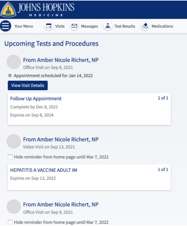
By logging back into MyChart on another date (Figure 7), I noticed another inconsistency. At the bottom of the home screen as seen in Figure 1, I see a mail icon with the text, View all (3). That same option now uses a calendar icon. Why the change? But when I click on “View all (3),”—theoretically related to my upcoming visits— it takes me to the Upcoming Tests and Procedures page, one of the 53 items listed in the “Your Menu” side panel. but it is not the main Visits page (Figure 8) where I thought I was going. I have four total upcoming tests and procedures listed, only one of them with details to view; the others prompt me to hide the reminder until March 2022. Once again, I feel as if my time is being wasted just by trying to view upcoming appointments.
Clicking on the Visits tab from the global navigation we are taken to a view of appointments that does not match the list in Upcoming Tests and Procedures, but the list makes sense as there are three upcoming appointments displayed (Figure 9). The organization of content on the Visits page should be used on other screens throughout MyChart. The Visits page is much easier to digest than the Upcoming Tests and Procedures page, but our attention on the home page isn’t drawn to the Visits tab. A final confusing aspect of the MyChart home page is that the number of unread appointment messages was still the same as my login shown in Figure 2. How does MyChart decide which one to display on my homepage and why is there any difference at all, as both are referencing appointments (Figure 10).
Figure 8. Clicking the View all for calendar icon takes the user to the Upcoming Tests and Procedures page, but not the Visits page.
Figure 9. Visits page, showing a different list of appointments than what is shown in Figure 8.
Figure 10. Clicking on the Messages icon, I see the same number of messages in the Appointment and Automated messages sections as I did on the previous login that had the view messages at the bottom. Inconsistency on what is displayed on the home screen.
Richard Davidson studied the different ways in which people respond to emotional events and developed the six dimensions of emotional style, one of which is attention, the ability to focus and screen out distractions. “The more focused we are, the more the prefrontal cortex exhibits a phase-locking response to external stimuli. Impulsivity exhibits an inverse relationship to the attention scale. The more unfocused we are, the more impulsive we tend to be,” Davidson wrote in Gazzaniga et al., 2013, p. 456. While we are all on a spectrum of emotional style, waiting for healthcare information produces many emotions in all of us and negative scenarios tend to drown out positive scenarios, because the neural connections for fear and anger are physically larger than the connections for happiness (Lecture notes, 10/27/21).
MyChart is rarely a source of good news; often information about our health is concerning and pending test results or a delayed response from a doctor can be very stressful. It is my contention that MyChart users are often anxious enough to undermine their ability to be attentive as they await medical information. For anyone that is receiving treatment or feeling ill their attention is negatively impacted, and they will have a harder time navigating the website. Searching for messages across multiple tabs, trying to figure out their language scheme, excessively long local navigation menu, and confusing overlaps in information architecture. The solutions I recommend in the next section would likely be supported by findings from usability testing, once again proving the importance of incorporating Neurodesign in all phases of interaction design projects.
Design Recommendations
Change the subject line of email notifications to signify if it is an automatically generated message, if it is a message from a person on the care team, or an appointment update. There is different subject line text if the email is regarding Test results. This simple improvement would help reduce wasted time and frustration with MyChart.
Improving the Message Center, if a hyperlink labeled “message” in an email brings you to the Message Center, finish the action by taking the user directly to the message. Currently you default onto the Conversations tab which might not be the right location of the new message (Figure 2).
The appointment page becomes a catch-all for automated messages, need to improve the categorization method and label any message that you can’t reply to as automated, thus reducing the number of times we get distracted by non-urgent emails (Figure 3)
Add the option to sort appointment messages by type or unread messages, currently it only sorts by date (Figure 3). The expectation is that people use MyChart throughout their life and thus hundreds if not thousands of messages could be generated. This simple addition would help the users find what they need faster and reduce the cognitive burden.
When you click “View all [messages]” it takes you to the conversation page, but often the new message is associated with a visit, so you must navigate away from the message center page in search of a message. The overlaps between Visits and Messages need to be sorted out, participatory design sessions with low literacy participant would be an ideal research project to discover the best way to resolve this issue. One possible solution is that Messages are absorbed by the Visits tab since most messages are referencing appointments. The exception being conversations that the user can start with any member of their care team, so replace Messages with Conversations and continue that language consistency throughout the website and email notifications.
The side panel of “Your Menu” is fully expanded, simple fix is to collapse the subsections and let the user expand the sections (Figure 5 & 6). However, the sections and links within should also be co-designed with participants. “My Record” is a misleading section title because there is no single record of all info, everything has a subcategory, there is no Record on the global navigation, but probably should exist.
Using the “positive” effects of distraction on MyChart should be considered with caution. Since people can have family members accounts linked to the MyChart it would be difficult to anticipate what a user wanted to accomplish. A version of Microsoft’s assistant or a chat bot could be helpful and passive enough to not further fragment the user’s attention. It is surprising that they don’t have a chatbot feature as that is very common.
Research Summary
The research into attention and distraction got its start with advertising in the 20th century and continues to be the primary funder of attention research in the 21st century. Looking at the past three years of research we see a lot of focus on social media and ways to keep users focused amid an increasingly distracting world. I begin this summary with research examples from the annotated bibliography, the first article being Attention Affordances: Applying Attention Theory to the Design of Complex Visual Interfaces. This text discusses the importance of creating products that reduce the cognitive load and provide accessible affordances. An encouraging takeaway is that it shows that neuro-design knowledge can impact a product even late in the design process (Andersen et al., 2021). Attention performance has also been studied in music selection: when users listen to preferred background music during low-demanding sustained-attention tasks, their focus increases and mind-wandering decreases (Kiss and Linnell, 2020). This research likely inspired products such as Neurosity’s Crown, a helmet style head piece marketed to programmers with disposable income that notices when focus and flow drift and changes the genre of music to nurture the user’s flow. This product hints towards attention control research attracting hardware investments, including some superfluous devices for the rich. I suspect other companies will try and outshine Neurosity’s Crown, it wouldn’t be hard to do as their website is suspiciously vague and limited on information.
From the Neurodesign resource document, (Liu et al., 2021), a recent study looked specifically at transmeridian flights that require pilots to have sustained attention for long periods. Fatigue and difficulty concentrating are common during such flights. Researchers used a functional near-infrared spectroscopy (fNIRS) to track changes in attention levels by way of a computer system designed to detect if the pilot disengages from the controls. If so, it sends a reminder to engage with ground control, for example. Research in this sector that helps pilots in these extreme conditions is likely to benefit all pilots. This research is software based but makes me wonder if there will come a time when pilots are wearing an evolved version of Neurosity’s Crown or some competitor’s version.
A recent eye tracking study adds another layer of complexity to attention research: looking at differences in visual attention given two types of thinking, analytic and holistic. Previous research suggests that analytical thinking is common in individualistic cultures and promotes attention to detail and focus on the most important aspects of a scene. Whereas holistic thinking is common in collectivist cultures and promotes attention to the overall structure of a scene and the internal relationships between components. The study by Alotaibi et al. (2017) compared groups from Great Britain, an individualist culture, and Saudi Arabia, a collectivist culture, both given the same visual search task: examining a simple natural scene. The results showed a higher overall number of fixations for Saudi participants along with longer search times, in other words, less efficient search behavior than British participants. These findings suggest that there is a positive relationship between an analytic cognitive style and controlled attention. This suggests that our attention and searching behaviors are partially influenced by our families and our cultures without us always noticing. As designers we need to be aware of the multitude of differences that humans experience. Unfortunately, depth of cultural impacts on our behavior is not discussed enough.
In the realm of social media, one study (Hashash et al., 2019) found that texting while driving is worse than social media browsing in terms of driving performance, although both are dangerous behaviors. Regardless, these dangers are not taken seriously enough by drivers. Some assume that only younger generations are texting while driving or browsing social media, but older drivers also use their phones while driving causing many crashes to occur. Addiction to social media and smartphones is affecting people both young and old. Another recent eye tracking study (Vraga et al., 2019) demonstrated that attention to social media posts is not associated with interest in the content; our attention is engaged even when a post is about something we don’t like or agree with. According to Kane (2019), some users feel helpless when it comes to controlling the amount of time that they spend on their devices. Digital products are in fact designed to be engaging and attention-grabbing and therefore nurture habit-forming behavior in young people. Some experience withdrawal when devices are taken away.
Mindfulness apps have become more popular over the past ten years as many Americans experience and deal with chronic anxiety. Part of the anxiety increase is due to the round-the-clock availability of social media: addictive distractions that result in avoidance of necessary tasks and builds anxiety. Substance abuse is another focus of attention especially since the pandemic. One team in China developed an app to help people with substance use disorders using attention bias modification interventions to change their behavior. This app is needed because in conventional psychology therapy there are gaps between treatment sessions during which users can revert to addictive behaviors resulting in relapses. The research team saw successful results from their intervention app but wants to improve the design through participatory design sessions. The research described in Zhang et al., 2019 is the first one of its kind in Asia and hopefully more research into this area will be funded.
Studies of activities that require Multiple Object Tracking (MOT) have shown that divided attention over long periods of time can enhance aspects of attention. One example is action video games, since there are frequently changing objects on the screen that the user must pay attention to in order to be successful. Bavelier & Green (2019) reported some early results showing improved attention, visual information processing speed, and working memory in young and in older adults as result of game activity. Discovering a positive benefit from playing action video games is encouraging because of their immense popularity but removing violence from them and expecting the appeal to remain is hard to fathom in this country.
Taking all of this in, we are confronted with an ongoing smartphone dilemma and a complicated space: action video games help improve attention capacity, but addictive social media use fragments our attention, and most gamers also use social media platforms. While China has taken steps to limit the amount of video games people play, it is very unlikely that our government will do something similar. Realistically, both games and social media are going to be with us for the foreseeable future. Some apps are good for us, but the temptation of staying too long on social media will always be there. We are social creatures and big tech uses that against us, deliberately manipulating our behavior, and gaslighting us when we call them out. Attention has become a commodity driving the technology market, seen by a rising adoption of split-revenue models for advertising, forcing customers to pay with their attention, viewing advertisements as the default, or paying a monthly fee to skip them (Kane 2019). Marketers know we will pay to skip the headache and wasted time of an advertisement.
Self-help books focusing on attention management have been steadily growing since 2010, but in the past three years alone you can find dozens of these books. One that caught my attention is How to do Nothing: Resisting the Attention Economy, written by Jenny Odell in 2020, described as a self-help book that turns into a political manifesto arguing against capitalism, and recommended by NPR. At the opposite end of the spectrum is Indistractable: How to Control Your Attention and Choose Your Life, written by Nir Eyal in 2019, an ethically questionable book about attention management. Eyal argues against reducing time on smartphones, and that if you get distracted by your phone at work that is a symptom of a dysfunctional company culture, not the fault of social media. This gave me concern, and I quickly discovered that Eyal first got a lot of attention for his 2014 book How to Build Habit-Forming Products. This book was on the Wall Street Journal best seller list and is regarded as Silicon Valley’s handbook for making technology habit-forming.
Learning about Eyal’s books was discouraging, but luckily, I was happily distracted by a couple attention books that include artistic backgrounds. The first book was Attention and Focus in Dance: Enhancing Power, Precision, and Artistry, written by Clare Guss-West, that is rooted in the attentional focus findings of researcher Gabriele Wulf. Clare’s approach helps dancers hone the skills of attention, focus and self-cueing to replenish energy. She saw a need for the book because many dancers use excessive energy deployment and significant counterproductive effort, which results in lack of stamina (Guss-West, 2020). The second book, Forms of Poetic Attention, argues that attention is poetry’s primary medium, and that the forms of attention demanded by a poem can train, hone, and refine our capacities for perception and judgment, on and off the page. She goes on to suggest that poetic language is better understood as an instrument for refining attention, identifying a link between poetic form and the forming of attention (Alford, 2021). Both books opened my mind to a broader potential of attention behavior training, and I hope more books come out that use arts and neuroscience to promote personal improvement.
Finally, a warning comes from the former director of the Harvard-MIT Ethics and Governance of AI Initiative, Tim Hwang. His book, Subprime Attention Crisis: Advertising and the Time Bomb at the Heart of the Internet warns that digital advertising is at risk of collapsing, because most online ads fail to work. Hwang states that the true value of our attention is wildly misrepresented, and the online advertising industry might be facing a crash like the 2008 housing crisis (Hwang, 2020). If the online advertising industry undergoes a major reform, we can safely assume the big tech giants will emerge unharmed. The smaller companies that depend on online advertisement revenue are more likely to be negatively impacted in this new doomsday scenario, because this is America. The research summary provided some silver linings but overall, I am more concerned about our future, knowing that private research conducted by big tech marches on improving the manipulations. The fear does inspire motivation to be an ethical design advocate, hopefully there will be enough people that feel the same way.
References
Alford, L. (2021). Forms of Poetic Attention. Columbia University Press.
Alotaibi, A., Underwood, G., & Smith, A. D. (2017). Cultural differences in attention: Eye movement evidence from a comparative visual search task. Consciousness and Cognition, 55, 254–265. https://doi.org/10.1016/j.concog.2017.09.002
Andersen, E., Goucher-Lambert, K., Cagan, J., & Maier, A. (2021). Attention affordances: Applying attention theory to the design of complex visual interfaces. Journal of Experimental Psychology: Applied, 27(2), 338–351. https://doi.org/10.1037/xap0000349
Bavelier, D., & Green, C. S. (2019). Enhancing attentional control: lessons from action video games. Neuron, 104(1), 147-163. https://www.sciencedirect.com/science/article/pii/S0896627319308335
Byrne, M., Anderson, J., Douglass, S., & Matessa, M. (2014, May). Eye Tracking the Visual Search of Click-Down Menu. Carnegie Mellon University. http://act-r.psy.cmu.edu/wordpress/wp-content/uploads/2014/05/chi99menu.pdf
Coulter, A., & Summers, K. (2014). Low Literacy Users. In R. J. Bergstrom & A. Schall (Eds.), Eye Tracking in User Experience Design (1st ed., pp. 331–348). Morgan Kaufmann.
Eyal, N. (2019). Indistractable: How to Control Your Attention and Choose Your Life (Illustrated ed.). BenBella Books.
Gazzaniga, M., Ivry, R. B., & Ph.D., G. M. R. (2013). Cognitive Neuroscience: The Biology of the Mind (Fourth ed.). W. W. Norton & Company.
Guss-West, C. (2020). Attention and Focus in Dance: Enhancing Power, Precision, and Artistry (First ed.). Human Kinetics.
Hwang, T. (2020). Subprime Attention Crisis: Advertising and the Time Bomb at the Heart of the Internet. Farrar, Straus and Giroux.
Jacobson, L.A., Koriakin, T.A., Lipkin, P.H., Boada, R., Frijters, J.C., Lovett, M.W., Hill, D.E., Willcutt, E.G., Gottwald, S., Wolf, M., Bosson-Heenan, J., Gruen, J.R., & Mahone, E.M. (2017). Executive Functions Contribute Uniquely to Reading Competence in Minority Youth. Journal of Learning Disabilities, 50, 422 - 433.
Jarrett, C., Redish, J., & Summers, K. (2017). Designing for People Who Do Not Read Easily. In L. Melonçon, (Ed.). Rhetorical accessability: At the intersection of Technical Communication and Disability Studies (pp. 39–66). Routledge, Taylor & Francis Group.
Kane, L. (2019, June 30). The Attention Economy. Nielsen Norman Group. https://www.nngroup.com/articles/attention-economy/
Kiss, L., & Linnell, K. J. (2020). The effect of preferred background music on task-focus in sustained attention. Psychological Research. https://doi.org/10.1007/s00426-020-01400-6
Kohl, D. (2021). IDIA 740: Neurodesign [lecture notes].
Liu A., Li B., Wang X., Zhang S., Zhu Y., Liu W. (2021) NeuroDesignScience: An fNIRS-Based System Designed to Help Pilots Sustain Attention During Transmeridian Flights. In: Russo D., Ahram T., Karwowski W., Di Bucchianico G., Taiar R. (eds) Intelligent Human Systems Integration 2021. IHSI 2021. Advances in Intelligent Systems and Computing, vol 1322. Springer, Cham. https://doi.org/10.1007/978-3-030-68017-6_25
Loranger, H. (2014, May 18). Accordions for Complex Website Content on Desktops. Nielsen Norman Group. https://www.nngroup.com/articles/accordions-complex-content/
Odell, J. (2020). How to Do Nothing: Resisting the Attention Economy. Melville House.
Shomstein, S. (2012). Cognitive functions of the posterior parietal cortex: top-down and bottom-up attentional control. Frontiers in Integrative Neuroscience, 6. https://doi.org/10.3389/fnint.2012.00038 The Neurochemistry of Focus. (2020, May 10).
PowerOnPowerOff. https://poweronpoweroff.com/blogs/longform/the-neurochemistry-of-focus
Vraga, E. K., Bode, L., Smithson, A.-B., & Troller-Renfree, S. (2019). Accidentally attentive: Comparing visual, close-ended, and open-ended measures of attention on social media. Computers in Human Behavior, 99, 235–244. https://doi-org.proxy ub.researchport.umd.edu/10.1016/j.chb.2019.05.017
Zhang, M., Ying, J., Amron, S. B., Mahreen, Z., Song, G., Fung, D. S. S., & Smith, H. E. (2019). A Smartphone Attention Bias App for Individuals with Addictive Disorders: Feasibility and Acceptability Study. JMIR MHealth and UHealth, 7(9), e15465. https://doi-org.proxy-ub.researchport.umd.edu/10.2196/15465
